Brand Scalability: How to Build a Visual Identity That Grows With You

Table of Content
-
Author

-
Published
25 Jun 2025
-
Reading Time
17 mins
Many Australian businesses face a common challenge. They start with a logo that looks great on business cards but not on social media. Their brand colours look good on screens but not in print. As they grow, their visual identity feels too small.
We get how frustrating this is. Creating a brand visual identity that grows with your business is key. It’s not just about looks today. It’s about building a system that lasts through your business’s growth.
Working with Australian businesses, we’ve learned scalability is essential. It’s not something you add later. Brands like Canva and Atlassian show that planning ahead is smart. They use designs that work across many platforms.
This guide shares our insights on creating visual identities that grow with your business. We’ll look at strategies used by Australian companies. These tips will help you keep your brand consistent while adapting to new challenges. Whether you’re expanding internationally or just want to future-proof your brand, these insights will help.
Key Takeaways
- Scalable visual identity starts with flexible design systems that adapt to various formats and platforms
- Successful Australian brands like Canva and Atlassian demonstrate the power of thinking ahead in brand design
- The importance of visual identity grows as your business expands into new markets and channels
- Building brand visual identity requires balancing consistency with adaptability
- Future-proofing your design saves time and resources as your business evolves
- Smart scalability planning prevents costly rebranding exercises down the track
Understanding the Foundation of Scalable Brand Design
Creating a brand that grows with your business is more than just pretty pictures. We must design a visual identity that changes with new markets, products, and platforms. Yet, it should keep its core spirit. Successful Australian brands know that scalability comes from careful planning and adaptable frameworks.
What Makes a Brand Truly Scalable
A scalable brand identity system works well across many uses without losing its strength. Take Atlassian, for example. Their branding is consistent from their project management tools to developer platforms. Whether you’re using Jira, Confluence, or Trello, their look stays the same.
The key traits include:
- Modular design elements that mix in different ways
- A clear hierarchy that works at various sizes
- Colour systems that work in both digital and print
- Typography that’s easy to read in all settings
The Role of Flexibility in Modern Branding
Today’s brands must be seen everywhere – from small app icons to big billboards. Canva shows this with their brand that changes across their design platform, educational content, and marketing. Their guidelines let for creativity while keeping recognition.
Flexibility means setting rules that guide but don’t limit. We keep core elements the same, then let teams get creative and adapt to local needs.
Key Elements of Future-Proof Design Systems
To make a visual identity that lasts, we must think about several parts:
| Element | Purpose | Scalability Factor |
|---|---|---|
| Logo Variations | Different contexts and sizes | Responsive versions for all platforms |
| Colour Palette | Brand recognition | Extended palette for diverse applications |
| Typography System | Consistent communication | Multiple weights and sizes |
| Grid Structure | Layout consistency | Adaptable to various formats |
These parts work together to make detailed branding guidelines. They support growth while keeping consistency across all touchpoints.
Why Visual Identity Matters for Growing Businesses
As your business grows, visual branding acts as a silent ambassador. It speaks to customers before you do. Studies show that a consistent brand look can increase revenue by up to 23%. This makes it a key investment for businesses looking to grow.
Creating a strong visual foundation early on is vital. It sets the stage for growth across different markets and platforms.
Building Recognition Across Multiple Touchpoints
Your brand meets customers through many channels. This includes social media, websites, packaging, and storefronts. Each interaction strengthens your corporate identity when done right.
Australian companies like Afterpay are great examples. Their mint green and clean typography make them instantly recognisable. This is true whether customers see them in-app, on partner websites, or in stores.
Creating Consistency in an Expanding Market
Expanding into new markets can be tough for keeping brand consistency. Koala, an Australian mattress company, shows how scalable brand assets help with growth. Their fun yet professional look works well from digital ads to physical showrooms.
This consistency allows for flexibility while meeting local market needs.
The Psychology Behind Memorable Brand Visuals
Our brains process visuals 60,000 times faster than text. This makes your visual branding the quickest way to grab customer attention and build trust. Colours, shapes, and consistent use all play a role.
We use these principles to craft visual identities that connect deeply with audiences. These identities stay memorable long after the first meeting.
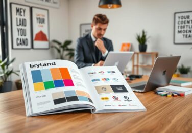
Core Components of a Scalable Brand Identity System
A strong visual identity package is key for your brand’s growth. It’s not just about a logo. You need a system that grows with you, staying consistent.
Every great brand starts with these key parts:
- Primary and secondary logos – Your main logo and variations for different uses
- Colour palette with extended options – Core colours plus extra shades for flexibility
- Typography hierarchy – Fonts for headlines, body text, and special uses
- Iconography system – A consistent look for symbols and graphics
- Pattern libraries – Design elements that help your brand stand out
Each part of your brand kit should work alone but together too. It’s like LEGO – each piece is unique but they all fit together. Your logo might be on a card, but it should look right with your colours on a website or with fonts in a presentation.
Brands like Spotify and Airbnb use this modular approach well. Their visual identity packages work across many platforms, from apps to billboards. This keeps their brand consistent, whether they’re in Sydney or worldwide.
Designing Logos That Adapt and Evolve
Today’s logos need to shine on many platforms. They must look great on small screens and huge billboards. Businesses want logos that can change but stay true to their core.
Responsive Logo Design Principles
We make logos that are flexible and strong. Take Commonwealth Bank’s diamond symbol, for example. It looks good from tiny icons to huge displays. The secret is to keep it simple.
Our method is called progressive reduction. We start with the full logo and then simplify it for smaller uses. Each version keeps the key elements that make your brand stand out.
Creating Variations for Different Applications
We make different logos for different needs:
- Primary logo for everyday use
- Simplified mark for social media
- Horizontal lockup for website headers
- Stacked version for square spaces
- Single-colour option for merchandise
Maintaining Brand Recognition Through Change
Telstra’s brand shows how to evolve without losing identity. Their ‘T’ has changed over time but is always recognised. We keep the core elements like colour and shape to keep your brand strong while exploring new ideas.
Building Comprehensive Branding Guidelines
Creating effective branding guidelines is like giving your brand a rulebook. It makes sure everyone knows how to show your brand’s visual identity right. Companies like REA Group and Domain in Australia have done this well. They let creativity shine while keeping things consistent.
Your brand style guide needs to find the right balance. If it’s too strict, you might stifle new ideas. But if it’s too loose, your brand could look different everywhere.
- Logo usage rules with minimum sizes and clear space requirements
- Colour palette specifications including RGB, CMYK, and Pantone values
- Typography hierarchy showing primary and secondary typefaces
- Photography style and image treatment guidelines
- Voice and tone principles for written communications
It’s good to document both what to do and what not to do with examples. Show your logo on different backgrounds and what not to do. Also, give templates for common uses. This helps teams and agencies keep your brand’s look without always watching over them.
Digital-first brands need guidelines for things like responsive design and social media. Your guide should grow as new platforms come along. This way, your brand looks the same on billboards or phones.
Developing a Flexible Brand Style Guide
Creating a brand style guide that fits your business needs is key. It’s important to avoid too much structure, which can stifle creativity. At the same time, too little structure can lead to confusion. The goal is to find a balance that guides teams while allowing for innovation.

Essential Elements to Document
Your branding guidelines should cover all the visual aspects. Here are the main things to include:
- Logo usage rules and minimum sizes
- Colour palettes with specific codes
- Typography hierarchy and font families
- Photography and illustration styles
- Iconography and graphic elements
- Spacing and layout principles
Setting Parameters Without Limiting Creativity
The importance of visual identity is in being consistent, not strict. We set clear rules that encourage creative thinking. Your guide should explain the reasons behind each rule, helping teams make smart choices when faced with new challenges.
Digital vs Print Considerations
Today, brands are everywhere, online and offline. Your guide needs to cover the specific needs of each:
| Digital Applications | Print Applications |
|---|---|
| RGB colour values | CMYK and Pantone codes |
| Screen-optimised fonts | Print-ready typefaces |
| Responsive sizing | Fixed dimensions |
| Web-safe alternatives | Specialty finishes |
Creating Modular Brand Assets for Multiple Platforms
Building a strong corporate identity means thinking beyond single designs. We create modular systems that work like building blocks. This lets your visual identity package adapt easily across different platforms and campaigns.
Think of modular brand assets as your design DNA. Each part—colours, typography, icons, and graphics—can mix in many ways. This keeps your unique identity while saving time and money. It ensures consistency in every customer interaction.
Australian retailers like Woolworths show how well this works. They handle thousands of promotional materials each week. From in-store signs to digital banners, their modular system makes new campaigns fast. Yet, their green apple logo and style are always clear.
Coles also uses a similar approach. Their red-and-white palette works on everything from receipts to billboards. This shows how modular systems can be efficient.
We build your visual identity package with key modular components:
- Flexible grid systems that adapt from business cards to building wraps
- Icon libraries that scale perfectly from app buttons to vehicle graphics
- Colour combinations pre-tested for digital screens and print materials
- Typography hierarchies that maintain readability at any size
This component-based approach changes how teams work with brand assets. Marketing teams can quickly make new materials without starting over. External agencies get clear guidelines for creativity. Your corporate identity stays strong, even as you explore new channels and opportunities.
Implementing Your Visual Identity Across Digital Channels
Digital platforms need smart adaptation of your visual branding. We help brands adjust to each platform’s technical needs while keeping the brand’s core elements. Every digital touchpoint, from social media to mobile apps, requires careful thought.
Social Media Adaptation Strategies
Each social platform has its own rules for visual identity design. Instagram wants square profile images and story templates at 1080×1920 pixels. LinkedIn likes horizontal banner images at 1128×191 pixels. Twitter asks for header images at 1500×500 pixels.
| Platform | Profile Image Size | Cover/Header Size | Post Dimensions |
|---|---|---|---|
| 180x180px | 820x312px | 1200x630px | |
| 110x110px | N/A | 1080x1080px | |
| 400x400px | 1128x191px | 1200x627px |
We suggest making platform-specific templates. These should keep your colour palette and typography. But also fit each platform’s culture. Your visual branding should feel right at home on each platform, yet stay true to itself.
Website and App Integration
Responsive design makes sure your brand looks great on any screen size. We use flexible grid systems and scalable vector graphics. This keeps everything clear, no matter the screen size.
Navigation icons, buttons, and interactive elements follow your visual guidelines. They also meet accessibility standards.
Email and Digital Marketing Applications
Email templates need special care to keep your visual identity consistent. We build modular components for Outlook, Gmail, and Apple Mail. Dark mode compatibility is key, with alternate colour schemes for both light and dark modes.
Scaling Your Corporate Identity for Global Markets
Expanding your brand worldwide needs careful thought on how it looks in different cultures. It’s about keeping things consistent globally but also making sure it feels local. Your brand must connect with people everywhere while staying true to its core.
Cultural Considerations in Visual Branding
Colours, symbols, and images mean different things in various cultures. What’s great in Sydney might not work in Shanghai or São Paulo. Aesop, an Australian skincare brand, shows how to balance this by keeping their simple look worldwide. They also change their product descriptions and images to fit local tastes.

- Colour meanings vary dramatically between regions
- Typography must accommodate different alphabets and reading directions
- Imagery should reflect local demographics and customs
- Packaging sizes and formats differ by market
Localisation Without Losing Brand Essence
Good localisation keeps your brand’s heart while reaching out to local markets. Zimmermann, a fashion brand, does this well. They change their campaigns for different seasons without losing their Australian style.
We suggest making flexible design systems. This lets local teams tweak some things while keeping the brand’s core safe. This way, your brand stays united worldwide but feels special in each place.
Managing Your Visual Identity Package as You Grow
As your business grows, keeping your brand consistent gets harder. A well-managed visual identity package is key to your growth. Without the right systems, even strong brands can lose their edge.
Setting up brand governance helps everyone see the importance of visual identity. We suggest:
- Clear approval for new brand materials
- Brand audits every quarter
- Brand champions in each team
- Digital asset management for easy access
Digital asset management changes how teams use your brand identity kit. Tools like Canva and Adobe make it easier to manage. They keep all approved logos and templates in one place, avoiding old versions.
Regular brand audits keep your look fresh. We recommend checking all customer touchpoints regularly. This ensures everything matches your brand standards, preventing drift during growth.
Empowering your team while keeping control is key. Offer templates, clear guidelines, and training. When your team gets the importance of visual identity, they become brand champions.
Common Pitfalls When Scaling Brand Visual Identity
Growing your brand visual identity can be tough. Many businesses face challenges that harm their visual branding. We’ll look at key mistakes and how to dodge them.
Avoiding Inconsistency Across Touchpoints
Inconsistent brand assets confuse people and hurt your market image. This happens when different teams use old logos or when social media doesn’t match websites. To fix this, create a centralised asset library for all teams to use the latest materials.
Preventing Brand Dilution During Expansion
Fast growth can lead to shortcuts in visual branding. New team members might not follow guidelines well, or quick campaigns might skip reviews. To avoid this, set up clear approval processes and do regular brand checks to keep things consistent.
| Dilution Risk | Prevention Strategy |
|---|---|
| Unauthorised colour variations | Lock colour codes in design software |
| Inconsistent typography | Provide font packages to all teams |
| Modified logo proportions | Supply pre-sized logo files |
Maintaining Quality Control Systems
As your team grows, keeping quality control can be tough. Set up regular review cycles for brand managers to check new materials. Use digital asset management systems to track versions and ensure approved assets are used. Consistency builds trust, and trust grows your business.
Conclusion
Creating a scalable visual identity is key for business growth. We’ve looked at the important parts of a brand identity system. These include responsive logos and style guides, which help keep things consistent and allow for growth.
The secret to good visual identity design is finding the right balance. Your brand needs clear rules to stay true to itself but also be open to new things. This way, it avoids the problems of being all over the place or losing its identity.
To make a visual identity that lasts, you need a solid plan and the right skills. Whether starting a new business or growing an old one, these tips help keep your brand strong and easy to spot. If you’re struggling with your branding, reach out to hello@defyn.com.au for help that fits your business.
FAQ
What exactly is brand scalability and why does it matter for Australian businesses?
How do we know if our current visual identity needs updating for scalability?
What’s the difference between a logo and a complete brand identity system?
How much should we invest in developing a scalable visual branding system?
Can we update our corporate identity gradually, or do we need a complete overhaul?
How do we ensure brand consistency when multiple teams create content?
What role does cultural adaptation play in scaling visual identity internationally?
How often should we review and update our visual branding?
What’s included in a complete brand identity package?
How do we balance flexibility with brand consistency in our guidelines?
Insights
The latest from our knowledge base