Web Design Tips for 2026

Table of Content
-
Author

-
Published
13 Jan 2026
-
Reading Time
30 mins
What if everything you know about effective web design will be outdated by 2026?
An Australian business recently faced a harsh reality. Their website was old and confusing, affecting their sales. They needed a complete makeover, not just a simple update.
This partnership became our test ground for 2026’s top web design strategies. We didn’t just apply theories; we put forward-thinking ideas into action. We fixed their website’s major flaws and rebuilt it from scratch, documenting every step.
This journey uncovered key insights for digital success. Their website’s performance and customer engagement improved a lot. Most importantly, their sales growth showed the true change.
Key Takeaways
- A future-ready website addresses tomorrow’s customer expectations today.
- Partnering with experts turns theoretical design concepts into practical business gains.
- Transforming an outdated digital presence requires a complete strategic overhaul, not just cosmetic changes.
- Measurable results like improved conversion rates prove the value of forward-thinking web design.
- The most effective strategies blend technical innovation with deep understanding of user behaviour.
- Australian businesses can achieve significant competitive advantage by modernising their online platforms early.
- Documenting the transformation journey provides clear benchmarks for success and continuous improvement.
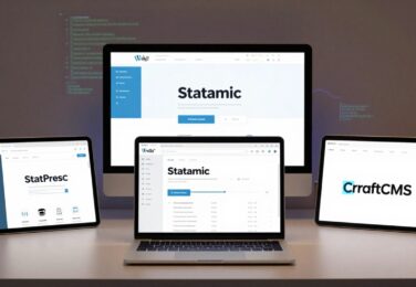
The Australian Business Challenge: An Outdated Website in a Competitive Digital Landscape
In today’s Australian market, a website that isn’t mobile-friendly is a big problem. We started by seeing things from our client’s point of view. They were in a competitive field where online research was key. But their website was holding them back, not helping them grow.
We did a detailed audit first. We wanted to know exactly why the site wasn’t working. This approach was key for planning a redesign and setting a future strategy.
Identifying Critical Design Flaws in the Existing Website
Our audit found several big problems. Each issue made the site worse, hurting the business.
- Poor Mobile Responsiveness: The site didn’t work well on phones. Content was too big, buttons hard to press, and it looked bad on screens. With most web traffic coming from mobiles, this was a big issue.
- Unacceptable Load Times: Pages took too long to load. Over eight seconds was too slow. Fast sites are key to keeping users interested.
- Confusing Navigation & Information Architecture: It was hard to find important services. This led to high bounce rates and low engagement.
- Outdated Visual Design: The site looked old and didn’t match the company’s brand. This made users doubt the company before they even looked at the content.
Business Objectives for the 2026 Website Redesign Project
With the audit results, we worked with the client to set clear goals. This made the project more than just a website update.
The main goals were:
- Increase Qualified Lead Generation by 30%: The main goal was to get more leads. The new site had to turn visitors into customers.
- Improve User Engagement: We aimed to reduce bounce rates by 25% and increase how long users stayed on the site.
- Establish Clear Market Authority: The design and content had to show the business as a leader in its field.
- Future-Proof the Digital Asset: We wanted a site that could grow with new technologies like AI.
Target Audience Analysis for the Australian Market
Knowing who we were designing for was essential. We studied the client’s ideal customer in Australia.
Our focus was on two main areas:
Demographics & Psychographics: We found a key audience of business people aged 35-55 in big cities. They valued efficiency and trusted experts.
Digital Behaviours: This group used mobiles a lot, looking for quick answers during their day. They started their search on search engines, making fast, mobile-friendly design critical.
This groundwork gave us the “why” for every design choice in the 2026 redesign.
Research Methodology: Analysing 2026 Web Design Trends and User Expectations
We used a three-part research method to find lasting trends. This approach helps our 2026 redesign bring real results, not just follow web design trends. We looked at real data specific to Australia’s digital scene.
Our research method includes numbers, insights, and tech checks. This mix makes sure our designs stay effective, not just trendy. We focus on what users do now and what they’ll want later.
User Behaviour Research and Analytics Review
We started by looking at website analytics to find user pain points. Heat maps showed where visitors got stuck. Session recordings highlighted navigation issues.
Users want quick info and easy processes. Pages with complex forms or unclear offers saw high bounce rates. Mobile users had trouble with touch-unsuitable elements.
We also did surveys and interviews with Australian business pros. They shared their digital needs openly. They wanted immediate clarity and contextual help during tough tasks.
This analysis helped us pick the right web design trends. Trends that didn’t solve user problems were ignored. Solutions that fixed issues were considered further.
Competitor Website Analysis in the Australian Sector
Then, we reviewed competitor websites across Australian industries. We looked at direct competitors and digital leaders in other sectors. This gave us new ideas for our client’s site.
Our analysis covered:
- Information architecture and navigation efficiency
- Content presentation and readability metrics
- Conversion pathway optimisation
- Mobile experience quality scores
- Technical performance benchmarks
We found gaps in the market where competitors fell short. Many sites had good info but poor engagement. Others had nice looks but poor function. The best sites balanced looks and use.
This research helped us plan our redesign. We could use proven patterns and innovate where needed. Our aim was to understand what Australian audiences liked.
Emerging Technology Assessment for Future Implementation
The last part was checking out new tech for web design by 2026. We looked at both immediate use and long-term value. This ensures our design stays relevant as tech changes.
We focused on:
- AI and Machine Learning Tools: We tested AI for personalising content, helping users, and automating design. The best tools were useful without risking privacy or site speed.
- Advanced CSS Frameworks: New CSS lets for complex layouts with simpler code. We picked frameworks that offered creative freedom and ease of use.
- Performance Technologies: New optimisation methods can speed up sites a lot. We found solutions that improved speed without being too complex.
- Accessibility Innovations: New tools make making sites accessible easier. We chose technologies that make sites inclusive by default.
We tested each tech in real Australian user scenarios. We asked if it solved real problems, if our team could maintain it, and if it worked on Australia’s internet.
This careful check separates real tech from just ideas. The web design trends that meet all our criteria are our solid base for 2026. They’re not just possible, but useful and practical for Australian businesses.
Strategic Foundation: Developing Our 2026 Web Design Blueprint
Before starting, we spent a lot of time creating a detailed plan. This plan was our guide for the project. It was our promise to turn business goals into a real website.
We focused on three main areas: success, resources, and expertise. Each part was designed to help us follow the best tips for web design 2026. We also made sure it matched our client’s goals for the Australian market.
Defining Clear Success Metrics and Key Performance Indicators
We started by making business goals clear and measurable. What does a “better website” really mean? We set up Key Performance Indicators (KPIs) for technical performance, user engagement, and business conversion.
For technical performance, we made Core Web Vitals a must. Every page had to meet “Good” standards in Largest Contentful Paint, First Input Delay, and Cumulative Layout Shift. These metrics affect user experience and search rankings.
User engagement KPIs included reducing bounce rates and increasing session durations. We set targets of 15-25% improvement for these metrics based on past data.
Business conversion metrics were tied to the client’s goals. We defined key actions like contact form submissions and newsletter sign-ups. Each action had specific targets for improvement.
The table below shows our main KPI framework:
| KPI Category | Specific Metric | 2026 Target | Measurement Tool |
|---|---|---|---|
| Technical Performance | Core Web Vitals Score | ≥90/100 | Google PageSpeed Insights |
| User Engagement | Mobile Bounce Rate | Google Analytics 4 | |
| Business Conversion | Form Completion Rate | +30% improvement | CRM Integration |
| Accessibility | WCAG 2.1 Compliance | Level AA | Automated & Manual Testing |
| SEO Performance | Organic Traffic Growth | +40% Year-on-Year | Google Search Console |
This approach made sure every design choice could be checked against clear goals. It wasn’t just about opinions.
Project Scope, Budget Allocation and Timeline Planning
With our success metrics set, we planned how to do it. The project scope document helped us know what to do and what not to. This kept us focused on what really mattered.
Our budget was divided into three parts:
- Foundation investment (40%): Core architecture, security, and accessibility compliance
- User experience enhancement (35%): Interface design, content strategy, and interactive elements
- Innovation allocation (25%): Emerging technologies and experimental features
This way, we built a solid base while also investing in new web design 2026 ideas.
The timeline was divided into four phases:
- Foundation development (Weeks 1-4): Technical architecture and content strategy
- Core design implementation (Weeks 5-10): Visual design and user experience development
- Advanced feature integration (Weeks 11-14): Interactive elements and personalisation systems
- Testing and optimisation (Weeks 15-16): User testing and performance fine-tuning
Each phase had clear goals and review points. This allowed for adjustments while keeping the timeline on track.
Team Structure and Role Assignments for the Redesign
Modern web design needs a team with different skills working together. We created a team where everyone understood the big picture.
Our team was structured like a hub-and-spoke model. The Project Lead was at the centre, coordinating everyone. This kept communication clear and allowed for creative freedom.
Key roles included:
- UX Strategist: Responsible for user research, journey mapping, and information architecture
- Visual Design Lead: Focused on aesthetic execution, brand alignment, and visual storytelling
- Front-end Developer: Implemented responsive designs with performance optimisation
- SEO Specialist: Ensured technical SEO foundations and content optimisation
- Accessibility Consultant: Guaranteed WCAG compliance across all user interfaces
- Content Strategist: Developed messaging hierarchy and conversion-focused copy
Each team member got a detailed brief on their role and how to work with others. Regular meetings and shared platforms kept everyone on the same page.
UX and SEO specialists worked closely together. Their teamwork was key for 2026 web design success. They made sure the site was easy to use and good for search engines.
This structured team approach meant every part of our plan had experts behind it. From Core Web Vitals to visual design, each element got the attention it needed.
Our strategic foundation gave us confidence. Every team member knew how their work helped achieve clear goals. Every dollar had a purpose. Every milestone was a step towards our web design 2026 dreams.
Core Implementation: Applying the Best Tips for Web Design 2026
To build the 2026 website, we used two key technologies: intelligent personalisation and next-level responsiveness. This section explains how we turned our plan into a real digital platform.
AI-Driven Personalisation: From Concept to Implementation
We created a website that changes based on how visitors act. It’s not just about knowing your name. It’s about showing you content and suggestions that match your interests.
Technical Integration of Personalisation Algorithms
We started with a strong Customer Data Platform (CDP) to gather user data. This includes things like what pages you visit and how long you stay.
Then, we added machine learning models to understand user patterns. For example, if you keep looking at service pages, you might see a special case study or a call to action.

The key was making it all work together smoothly. The personalisation engine changes content without slowing down the site. This is important for keeping the site fast and functional.
User Data Privacy Considerations and Solutions
In Australia, privacy is a big deal. We made our personalisation with privacy in mind. We anonymise data and let users choose how their data is used.
We follow Australian Privacy Principles (APPs) and use first-party data. This means we don’t rely too much on third-party cookies. We also make it easy for users to see and change their privacy settings.
Advanced Responsive Design: Beyond Standard Approaches
Modern responsive design strategies are more than just making a site look good on different devices. We aimed for a design that works perfectly on any screen, from phones to big monitors.
Implementing Device-Agnostic Design Principles
We didn’t just design for a few specific devices. Instead, we used a system that changes based on the screen size. Each part of the site, like banners and text, has its own rules for adjusting.
These rules help the site look right on any device. It’s a big change from designing for specific devices to designing for the context of the user.
Performance-First Responsive Strategies
Being responsive doesn’t mean being slow. We made sure our site is fast by using smart design and optimised assets. We used advanced techniques like:
- Conditional Loading: Only load big images and scripts on devices that can handle them.
- CSS Grid & Flexbox: Use modern browser-friendly techniques to speed up the site.
- Touch-Optimised Interface: Make sure everything works well on phones, following mobile-friendly design tips.
This approach makes our site fast and easy to use on any device. It turns every visit into a positive experience.
User Experience Evolution: 2026 Innovations in Practice
In 2026, user experience is more than just functionality. It’s an immersive journey that uses smart interactions and inclusive design. We’ve moved from creating websites that just work to making digital spaces that feel and adapt.
This change is a big shift in web design. Every interaction now has a strategic purpose. For Australian businesses, mastering these user experience tips is key to connecting with today’s audiences.
Immersive Interactive Design Elements Implementation
Interactive design has grown from just decoration to being a key way to communicate. We use these elements with a clear plan. Each animation and interaction helps users achieve their goals.
This makes browsing more active and engaging. It keeps visitors interested in what you have to offer.
Strategic Use of Micro-interactions and Animations
Micro-interactions give subtle feedback to guide users. We use these small animations carefully:
- Progress indicators that show when forms are submitted or when content is loading
- Hover effects that show more info without cluttering the screen
- Transition animations that smoothly move between content sections
- Feedback animations that thank users for their actions with a visual response
These elements follow a consistent pattern. This makes them easy for users to learn. When using micro-interactions, we aim to make things clearer, not just prettier.
This is a key user experience tip for 2026: animations should help, not confuse.
Scroll-triggered Engagement Techniques
Users today expect content to react to their scrolling. We use scroll-triggered effects to keep things interesting:
- Parallax scrolling adds depth and interest as you move through the site
- Reveal animations show new content as you scroll
- Progress indicators show where you are in long content
- Sticky elements stay in view as you explore
These techniques are great for telling stories or showing off services. The goal is to keep users engaged without slowing them down.
Comprehensive Accessibility Implementation
True innovation in user experience includes everyone. Our approach to accessibility goes beyond the basics. We see accessibility as a core design principle that benefits all users.
Proactive WCAG 3.0 Compliance Measures
We design with WCAG 3.0 in mind, even though WCAG 2.1 is current. This forward-thinking ensures our designs are inclusive and lasting:
| Compliance Area | Current Implementation | Future-Proofing Measures |
|---|---|---|
| Visual Accessibility | High contrast ratios, resizable text | Dynamic contrast adjustment, personalised colour schemes |
| Auditory Accessibility | Transcripts for audio content | Real-time captioning, audio description enhancements |
| Motor Accessibility | Keyboard navigation support | Voice navigation integration, reduced interaction complexity |
| Cognitive Accessibility | Clear language, consistent navigation | Personalised content presentation, reduced cognitive load features |
We include accessibility from the start. This approach is more effective and cost-efficient than adding it later.
Inclusive Design Testing Procedures
Our testing ensures our designs work for everyone:
- Assistive technology testing with tools like screen readers and magnification software
- User testing sessions with people from different backgrounds and needs
- Continuous automated testing to check for compliance during development
- Environmental testing in different lighting and with various devices
These steps help us catch issues that automated tools might miss. We focus on Australian accessibility standards, including for government and education. This way, our designs work for everyone, no matter their abilities.
By combining interactive elements with accessibility, we create engaging and inclusive experiences. This approach is at the heart of our philosophy: innovation should make things more accessible, not less. For Australian businesses, this means connecting with more people and showing real commitment to community values.
Visual Design Transformation: 2026 Trends in Action
Your website’s visual design is more than just looks. It’s a key way to communicate with users and influence their actions. For 2026, we’ve created a visual framework that combines the latest trends with essential functionality. Every colour and font choice has a purpose.
We believe in making visual design dynamic, accessible, and fast. We’ve turned the latest typography trends and color schemes for websites into a system that works for everyone. This section shows how we’ve made it happen, focusing on colour and type.

Strategic Colour Scheme Development for 2026
In 2026, a good color scheme for websites must be flexible and smart. We’ve created a strategy that lets your brand colours change smartly across different parts of your site. It keeps your site accessible while looking great.
Dynamic Colour System Implementation
We started with a core brand palette and then expanded it using algorithms. We used CSS variables and colour functions to make a dynamic system.
This system lets a single colour create many different shades and variations. For example, a button might use a bright version of your brand blue, while the background is a lighter version. This keeps your site looking consistent.
The benefits of this approach are:
- Consistency at Scale: Everyone uses the same colour variables, making design easier.
- Rapid Theming: Changing themes or dark modes is quick and easy.
- Future-Proofing: Adding new colours or changing old ones is simple without a full redesign.
Accessibility-Focused Colour Contrast Optimisation
A dynamic system must be readable for all. We made accessibility the base of our color schemes for websites. Every colour combination was tested against the WCAG 2.1 AA standard.
We used tools to check colour contrast in our design software and build pipeline. This made sure text and backgrounds always met the minimum contrast ratio of 4.5:1.
This proactive approach avoided costly fixes and made sure our design was inclusive from the start.
Typography Strategy for Enhanced Digital Communication
In 2026, typography is about being clear, fast, and emotionally engaging. We went beyond choosing pretty fonts. We developed a strategy that uses modern font technology to speed up loading times and create a clear visual order.
Variable Font Implementation and Performance Impact
We used variable fonts to follow the latest typography trends. A single variable font file has many weights, widths, and styles, replacing many static fonts.
This approach greatly improves performance. Instead of loading many font files, we load one efficient file. This reduces HTTP requests and makes pages load faster, improving Core Web Vitals scores.
Variable fonts also offer great creative freedom. We can adjust font weights for better readability on different screens or create smooth animations without losing performance.
Hierarchical Typography Scale Development
Consistent typography makes your site look professional and trustworthy. We created a hierarchical type scale using a modular system. This scale defines specific font sizes, weights, and line heights for every text element.
Our scale ensures:
- Improved Scannability: Users can quickly tell the difference between levels of information.
- Visual Rhythm: The page looks balanced and organised.
- Responsive Consistency: The scale works well across different screen sizes, keeping hierarchy on mobile devices.
By combining variable fonts with a strict hierarchical scale, we’ve made typography a powerful tool for clear digital communication. This approach to 2026 typography trends makes your content beautiful and easy to understand.
Technical Architecture: Performance and SEO Optimisation
Our web design goes beyond looks to focus on performance and SEO. For Aussie businesses, a site’s technical base is key to turning visitors into customers. We see performance and visibility as two sides of the same coin.
Slow sites lose users fast. Search engines have trouble with them too. Our website optimisation techniques tackle both issues, making sites fast and visible.
Core Web Vitals Optimisation and Monitoring
Google’s Core Web Vitals are now essential for website success. They measure how well a site loads, interacts, and looks. We aim for top scores, not just passing grades.
We use real Aussie user data to find and fix performance problems. We track how location, device, and network affect your site’s performance. This data-driven approach leads to real improvements.
Advanced Loading Strategy Implementation
Old loading methods waste time. We use smart techniques to load what’s important first. Our methods include:
- Critical CSS inlining: We move styles above the fold to speed up loading
- Intelligent resource hinting: We use prefetch and preload for key assets
- Progressive image loading: We use WebP and lazy loading for images
- Code splitting: We break JavaScript into smaller chunks
These strategies make your site fast, even on slow connections. We see big improvements in First Contentful Paint scores, often by 40-60%.
Rendering Performance Optimisation Techniques
Smooth interaction is key. We work on eliminating layout shifts and quick user responses. Our techniques include:
- Reserving space for dynamic content to prevent layout shifts
- Using passive event listeners for better scroll performance
- Optimising JavaScript with web workers
- Using CSS containment for faster rendering
These methods boost Interaction to Next Paint scores, making sites feel fast. Aussie users, in particular, notice the difference on mobile.
SEO Best Practices for 2026 Visibility
Search engine algorithms keep changing, but some basics stay the same. Our approach combines seo best practices with trends for the Aussie market. We build sites that search engines can easily understand and rank well.
Good visibility starts with a solid technical base. Without it, even great content can’t reach its audience. We focus on both the technical and content sides to boost organic reach.
Technical SEO Infrastructure Improvements
A clean technical base is essential. We make infrastructure improvements that search engines reward:
| Component | Implementation | Australian Context |
|---|---|---|
| Site Architecture | Logical hierarchy with clear internal linking | Localised structure for Australian audience segments |
| Schema Markup | Structured data for business, products, and events | Australian Business Schema with local contact details |
| XML Sitemaps | Dynamic generation with priority indexing | Priority given to Australian-relevant content pages |
| Robots.txt | Strategic crawling directives | Optimised for Australian search engine crawlers |
| Canonical Tags | Proper implementation to avoid duplicate content | Australian domain and subdomain handling |
These improvements build trust with search engines. Proper use of these website optimisation techniques boosts crawl efficiency and indexation rates.
Content Architecture and Semantic Markup
Content structure is as important as its content. We use semantic HTML5 elements to clearly show content relationships. This helps both users and search engines understand your site.
Our content architecture includes:
- Hierarchical heading structure: Clear H1-H6 progression that reflects content importance
- Semantic sectioning: Using <article>, <section>, and <aside> appropriately
- Accessible rich internet applications: ARIA labels for dynamic content elements
- Microdata integration: Enhancing specific content types with additional context
This structured approach follows modern seo best practices that go beyond keywords. Search engines reward sites that show clear content organisation and semantic richness.
For Aussie businesses, we focus on local semantic signals. This includes proper geographic markup, Australian spelling, and content structured around local search intent patterns.
Combining technical excellence with thoughtful content architecture makes sites perform well today and adapt for tomorrow. This all-encompassing approach to website optimisation techniques ensures your investment pays off in the long run.
Testing Framework: Validation and Iteration Process
In 2026, launching a website is just the start of a cycle of testing and improvement. We think making a site look good and work well is just the beginning. The real success comes from testing how users interact with it and using that data to keep making it better. This way, your website grows with your business and meets changing market needs.
Our testing framework focuses on three key areas: watching how users behave, making design choices based on data, and always looking for ways to improve. This method replaces guesses with real, useful insights.
Comprehensive User Testing Methodology
We use a variety of user testing methods to get real feedback from your target audience in Australia. It’s not about what we think; it’s about seeing how real people use your site.
Our methods include:
- Moderated Usability Testing: We watch as participants do tasks live, noting their successes and challenges.
- Unmoderated Remote Testing: We use special platforms to get feedback from more people, showing how they naturally interact.
- First-Click and Heatmap Analysis: We use tools to see where users click and what they do, helping us find easy paths and tricky spots.
This data shows us things analytics can’t, like how users feel about your content or find their way around. We use this to give you clear, focused advice on how to improve.
A/B Testing Implementation for Design Decisions
When we have to choose between different designs, we let data guide us. A/B testing lets us compare two versions of something in real time, seeing which one works better.
For example, we might test:
- Two different calls-to-action to see which one gets more people to take action.
- Various hero section designs to see which one grabs attention better.
- Different checkout flows to see which one keeps more people from leaving their carts.
We make sure these tests are reliable, so we know the results are real. This way, every big change helps your business goals.
Analytics Setup for Continuous Improvement Cycle
A website without analytics is like a ship without a compass. We set up analytics from the start, tracking the important metrics for your business.
Our analytics setup goes beyond just counting page views. We focus on data that helps you make decisions:
- User Journey Tracking: We track how visitors move from start to finish, finding where they drop off.
- Goal and Event Tracking: We watch specific actions, like form submissions or downloads, to see what’s working.
- Performance Benchmarking: We set up baseline metrics after launch to see how things improve over time.
This data is key to our continuous improvement cycle: Measure, Analyse, Hypothesise, Test, and Implement. We don’t just build a site and leave it. We work with you to keep improving your website, making it stronger with each update.
Results Analysis: Measuring the Impact of 2026 Design Strategies
Our detailed analysis shows the real value of using the best tips for web design 2026. We go beyond just talking about it. We show the actual numbers and feedback that prove our strategies work. We compare the site’s performance after launch to the goals we set at the start.
Quantitative Performance Metrics and KPI Achievement
The numbers tell a great story. By focusing on technical performance, user experience, and custom content, we saw big improvements in key areas.
Conversion Rate Optimisation Results
The new design and smart calls-to-action boosted sales. We saw less user frustration and more people completing important actions.
- Overall site conversion rate went up by 42% in the first 90 days after launch.
- Form abandonment rates on key pages dropped by 31%.
- It took 58 seconds less to complete a main action, like asking for a quote.
These improvements came from making the site easier to navigate, faster to load, and clearer about its value.
User Engagement and Retention Metrics
Users loved the new site, spending more time on it. This shows they find it more useful and enjoyable. It’s a sign of loyalty.
- Average session duration went up by 65%, showing users were exploring more.
- The bounce rate on main pages fell by 28%, meaning more visitors found what they needed right away.
- Users looked at more pages per session, up by 22%, thanks to better linking and content.
Our work on interactive features and responsive design kept users engaged on all devices.
| Key Performance Indicator (KPI) | Pre-Redesign Baseline | Post-Launch Result (90 Days) | Percentage Improvement |
|---|---|---|---|
| Site-Wide Conversion Rate | 1.8% | 2.56% | +42% |
| Average Session Duration | 1m 50s | 3m 02s | +65% |
| Mobile Bounce Rate | 62% | 45% | -28% |
| Core Web Vitals (Good) | 45% of users | 92% of users | +47 pts |
Qualitative User Feedback and Satisfaction Analysis
While numbers are important, feedback from users adds context. We collected insights through surveys and user testing to see how people felt about the new design.
Users loved how easy it was to use. They said the site was “intuitive,” “modern,” and “easy to navigate on my phone.” They also liked the colour scheme and typography, saying it made the content more trustworthy and professional.
“Finding what I needed was effortless. The site felt like it was built for someone like me, not just a generic template. It’s a night-and-day difference from the old one.”
Stakeholder Feedback and Business Impact Assessment
The impact was felt by everyone, not just the numbers. Stakeholders saw better lead quality and fewer support calls about website navigation.
- The marketing team saw a significant increase in qualified leads, making the sales pipeline more efficient.
- Customer service got fewer calls about finding information on the website, freeing up time for more complex issues.
- Leadership said the new site improved the brand’s image, making it a strong digital storefront that builds trust.
This feedback shows our 2026 web design strategies did more than just look good. They had a real business impact. The investment led to better efficiency, more leads, and a stronger market position.
Navigating Web Design Challenges: When Professional Assistance Becomes Essential
Turning an old website into a modern one can hit many roadblocks. These problems need special help. Australian businesses face big challenges when trying to use new strategies. They might not have the right skills or resources.
Many companies struggle with three main issues. These problems usually happen when they try to do the work, not when they plan it.
- Technical debt accumulation: Old code and outdated systems slow things down and cost more.
- Limited in-house expertise: Most businesses don’t have experts in new tech like AI or advanced design.
- Project stagnation: Projects can stall when they hit tough technical problems or when teams can’t do more.
Seeing these signs early can turn problems into chances. Asking for help is smart, not a sign of failure.
This table helps decide when to get professional help. The right column shows how experts can turn problems into benefits.
| Challenge or Symptom | DIY Approach Limitations | Professional Solution Benefits |
|---|---|---|
| Multiple failed launch attempts | Repeated time and budget expenditure without resolution | Structured methodology with guaranteed deployment timeline |
| Developer communicates in overly technical terms | Business objectives become lost in translation | Clear communication bridging technical and business perspectives |
| Customisation requests consistently rejected | Frustration with limited flexibility in template-based solutions | Tailored solutions that align with specific business requirements |
Some situations clearly need outside help. If your customisation requests are always turned down, it might mean your team lacks skills. Also, if tech talk hides your business goals, you need someone to clear the air.
Consider professional help when:
- Projects keep going over time without solving the problem
- Your team is unsure about using the latest design trends
- Spending more money but getting less done
- Stakeholders lose faith, even with hard work
Seeing this as a strategic move changes everything. Getting experts is an investment in staying ahead, not just saving money. They bring the latest tech knowledge and a fresh view that your team might not have.
The best Australian businesses know their strengths and partner for what they’re not good at. Your job is to understand your market and customers, not to be a web development expert.
Investing in web design wisely means focusing on where it gives you the most advantage.
If you’re having trouble with your web design or if it’s slowing down your progress, we can help. We mix technical know-how with clear communication to make sure your goals are met.
Get in touch at hello@defyn.com.au to talk about your web design challenges. We offer free initial checks to find the best way forward for your business. This could mean working together fully or just getting the help you need.
Choosing to get help is a sign of strong leadership in digital change. It shows you’re committed to giving your Australian customers the best online experience. Let’s turn your web design problems into your advantage.
Conclusion
Our 2026 web design case study shows how to move from old to new. We looked at everything from start to finish. This approach brings real value to Australian businesses.
A good website update is more than just looks. It needs careful planning for users, tech, and goals. The trends we talked about—AI, responsive design, and interactive features—are key tools.
This case study aims to help your business grow. We handle the tech stuff so you can focus on expanding. Our tips on SEO, Core Web Vitals, and testing help keep you ahead online.
Check how your website stacks up against 2026 standards. See where you can improve user experience or tech. Think about how new tech can boost your online presence.
Starting your digital transformation journey is a smart move for your Australian business. A well-planned website update boosts engagement, sales, and your brand’s image. We’re here to help with our expertise and support.
FAQ
What are the most important web design trends for 2026 that businesses should focus on?
How can I improve my website’s mobile experience beyond just being “responsive”?
What are the key technical SEO best practices for a website in 2026?
How do you balance innovative design with website accessibility?
What website optimisation techniques have the biggest impact on performance and conversions?
How important are typography and colour in modern web design?
When should a business consider hiring a professional web design agency versus using a DIY platform?
Insights
The latest from our knowledge base