Professional services websites that convert: the exact homepage structure
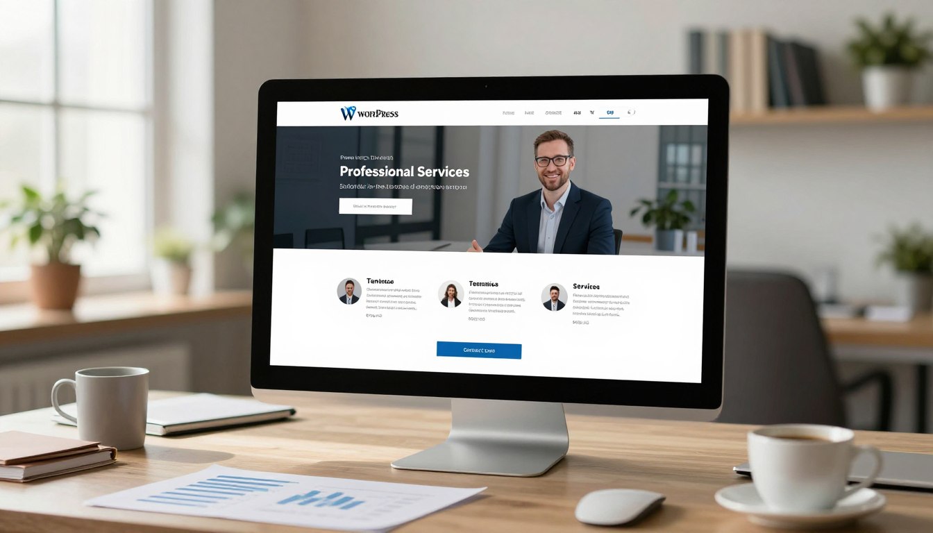
Table of Content
-
Author

-
Published
13 Mar 2026
-
Reading Time
55 mins
Did you know that 68% of professional services websites lose visitors within 15 seconds? This is because their homepage doesn’t clearly show its value. Your website is in a fierce battle for attention in those first few seconds.
We’ve been perfecting web development in Penrith and more, focusing on professional services firms. Many businesses spend a lot on websites that are just expensive digital brochures.
Your homepage is your most important digital asset. Every part must prove its worth by helping you meet your goals.
This isn’t just about design. It’s battle-tested methodology we’ve honed. We’ve built high-performing sites for accountants, lawyers, consultants, and specialists all over Australia.
We’re tackling the challenge you’re facing now. We want to turn passive browsers into active prospects who book meetings. The approach is different for professional services. They need to build trust, not make impulse buys.
Key Takeaways
- Your homepage has 15 seconds to show its value before visitors leave
- Professional services websites need psychology-driven structures, not product-based designs
- Every homepage element must contribute measurably to conversion goals
- Strategic web development turns browsers into qualified leads through proven methodology
- Homepage effectiveness determines your digital ROI more than any other page
- Trust-building architecture differs fundamentally from retail conversion tactics
Why Most Professional Services Homepages Fail to Convert Visitors
We’ve looked at hundreds of professional services websites in Australia. We see the same mistakes over and over. These mistakes are not random but systematic, leading to lost opportunities. The good news is that once you know what’s wrong, you can fix it.
One big mistake is focusing too much on company history. Professional services firms often put their founding story and years in business on the homepage. But visitors want to know if you can solve their problem. If your homepage doesn’t answer this quickly, you’ve lost the battle.
Many businesses spend a lot on website design, hoping it will bring in leads. But we see that beautiful websites don’t always work. The problem is that design needs to help with conversion, not just look good.
Here are the main problems that hurt conversion rates on professional services homepages:
- Navigation confusion: Too many choices in menus that confuse visitors and stop them from taking action
- Industry jargon overload: Using technical language that shows expertise but confuses clients
- Unclear value propositions: Homepages that don’t clearly show what makes their service special
- Buried calls-to-action: Contact buttons hidden away instead of being easy to find
- Slow load times: Websites that take too long to load, with 53% of mobile visitors leaving if it’s over three seconds
- Poor mobile responsiveness: Websites that don’t work well on mobiles, even though most visits come from mobiles
Let’s look at a real example. We found a legal services firm with a homepage that showed their office and team in a video. The video took eight seconds to load. During that time, the headline just said “Excellence in Legal Services,” without any specific benefits.
Their menu had seventeen links, all using legal terms that were hard to understand. Their main call-to-action was at the bottom of a long page, saying “Get in touch” without a clear next step.
This website looked great. The photos were professional, the colours were nice, and the design was up-to-date. But their conversion rate was very low, at less than 0.8%.
Technical problems add to these structural issues. We often check websites and find they don’t do well on Google’s page experience quality tests. Slow servers, big images, and too many scripts make it hard for visitors to take action.
Mobile responsiveness is also key. When we test websites on mobiles, we often find problems. Contact forms don’t work, phone numbers can’t be clicked, and menus are hard to use. For local businesses, these problems mean lost money.
Another big problem is when the homepage doesn’t match what visitors want. Visitors usually come looking for solutions, to compare services, or to contact someone. Most homepages are set up for only one of these, leaving the others confused.
Many firms think their expertise is enough. They list their credentials and qualifications without showing how these help clients. Visitors don’t care how long you’ve been in business. They want to know if you can solve their problem now.
We share these insights to help, not to criticize. Every professional services firm we work with has these problems. Knowing which ones are hurting your conversion rate is the first step to fixing them.
Often, websites have many problems at once. A slow-loading, confusing website with a hard-to-find call-to-action can lose up to 70% of visitors compared to a well-designed one.
These problems aren’t about your business or service. They’re about the design choices you make. Understanding these issues helps you create a homepage that works better.
The Psychology Behind High-Converting Homepage Design
The difference between good and great homepages isn’t just about design. It’s about understanding how our brains process information. When someone visits your website, they quickly judge if it’s credible and relevant.
Knowing these psychological rules makes designing homepages a science, not just a guess. We’ll look into how visitors turn into clients or leave.
Cognitive load is key in every decision. It shows why simple designs beat complex ones. Our brains can only handle so much at once. Too many choices or too much information can slow us down.
This slowdown often leads to people leaving. Web designers in Penrith aim to keep this in mind. Every extra element adds to the mental load on visitors.
Effective homepages cut down on cognitive load. They use clear designs and focused messages. It’s not about making things simple. It’s about respecting how our brains work when we make choices.
“People don’t want more choices. They want to be more confident in the choices they make.”
Social proof psychology is another key principle. Humans look for validation, even when making big decisions. Before committing, people want to see that others have trusted you.
This isn’t about tricking people. It’s about giving them the reassurance they need. Things like client logos and testimonials help answer the question: “Have others trusted you and had good results?”
The reciprocity principle also plays a big role. When we give something valuable without expecting something in return, people feel a sense of obligation. It’s not about giving away all your secrets. It’s about showing enough value to build trust.
We see this in things like free guides and blog posts. These help build goodwill and show you’re genuinely helpful. It makes people think positively about your brand.
The paradox of choice shows why too many options can hurt. Too many choices can make people unsure and leave. Good homepages guide visitors through a clear path.
Research shows too many choices can make people anxious and leave. Good homepages make decisions easier by simplifying options. They don’t hide information but present it in a clear order.
Applying these principles to design needs both science and skill. The best web developers in Penrith use these principles to make better homepages. They design with a clear plan, not just by guessing.
This approach isn’t about tricking people. Ethical conversion design makes it easier for visitors to do what they want. It helps them make decisions without feeling pushed.
Every design choice we make comes from these psychological principles. From the hero section to call-to-action, we use science to make decisions easier for visitors.
Understanding these principles helps us make better designs. We’re not just guessing. We’re using science to make our homepages more effective.
The Hero Section: Your 3-Second Conversion Window
Visitors make a quick decision when they land on your homepage. This decision can make or break your success. Studies show that first impressions are made in milliseconds, affecting whether they stay or leave.
Your hero section needs to answer three key questions quickly: “What do you do?”, “How does it benefit me?”, and “What should I do next?” If these questions aren’t answered clearly, visitors will leave without exploring further. We’ve seen many creative designs fail to convert well.
The hero section must balance looks and clarity. Every element should help with your conversion goals. It’s about being efficient, not just creative.
You never get a second chance to make a first impression.
Crafting a Value-Driven Headline That Addresses Client Pain Points
Headlines that focus on client transformation work better than those that highlight company credentials. Your headline is the most important text on your homepage. It decides if visitors want to learn more or look elsewhere.
We suggest a formula for professional services headlines. First, identify the problem your ideal client faces. Then, talk about the outcome they want. Lastly, show how your service can help them achieve that.
Headline length is key. Our research shows 6-12 words is usually best. Too short and it lacks detail, too long and it’s hard to read.
| Weak Headlines | Strong Headlines | Why It Matters |
|---|---|---|
| Premier Legal Services For Over 30 Years | Protect Your Business From Employment Law Disputes | Strong headline focuses on client benefit, not company history |
| Accounting Excellence You Can Trust | Reduce Your Tax Burden With Strategic Planning | Specific outcome beats vague quality claims |
| Leading Financial Advisory Firm | Build Wealth That Supports Your Retirement Goals | Client transformation outperforms firm positioning |
| Professional Web Development Services | Convert More Visitors With Custom Web Development Penrith Businesses Trust | Local relevance and clear benefit increase engagement |
Clever headlines are not as effective as clear ones. When testing, focus on clarity over creativity. Visitors are looking for solutions, not entertainment.
Subheadlines add important details. They support your headline by adding specifics and credibility. A good subheadline might mention your unique approach, experience, or client results.
For firms with enough traffic, A/B testing can improve conversion rates. Test one thing at a time, like problem focus versus outcome focus. Keep track of results to learn what works for your audience.
Strategic Placement of Your Primary Call-to-Action
Your main call-to-action should be above the fold, visible without scrolling, on all devices. This ensures it’s seen during that critical three-second window. We’ve seen a 20-40% increase in conversions when CTAs are prominent.
Button CTAs work better than text links for professional services. They stand out without looking too flashy. The button should naturally draw the eye after reading your headline.
How you write your CTA copy matters a lot. Specific, benefit-driven text like “Schedule Your Free Consultation” works better than generic “Contact Us”. The copy should reinforce your value and reduce risk.
Follow these CTA best practices for better conversions:
- Single CTA principle: Offer one clear next step to avoid decision paralysis
- Visual hierarchy: Use directional cues to naturally draw attention to the button
- Colour psychology: Choose colours that contrast well with your background and brand
- Mobile optimization: Make buttons thumb-friendly and position them for mobile users
- Accessibility compliance: Ensure contrast ratios meet WCAG standards
Understanding how visitors read your site helps place CTAs better. Most scan in F-patterns or Z-patterns. Place your CTA at these patterns’ ends. Heat mapping data shows where visitors naturally look.
Custom web development Penrith firms can track CTA performance closely. Use analytics to make informed decisions, not guesses.
Visual Elements That Build Immediate Credibility
Real photos of your team and clients beat stock images. Visitors trust real images more. They show transparency and authenticity.
Visuals send many credibility signals at once. The right images show professionalism, approachability, and expertise. They communicate a lot without needing words.
Background video can engage visitors if used right. But it can slow down your site and distract from your message. Use video only when it shows your expertise or results well.
Trust badges, certifications, and affiliations boost credibility. They work best when not too prominent. Place them near your CTA or subtly in your design.
Key considerations for hero section visuals:
- Maintain visual hierarchy: Headlines and CTAs should stay the focus
- Optimize for mobile-first: Images should look good on small screens
- Implement proper alt text: Describe images for screen readers and SEO
- Ensure colour contrast: Text should be easy to read for all users
- Test load performance: Images shouldn’t slow down your site
Every visual element should help with your conversion goals. Remove anything that doesn’t support credibility, clarity, or action toward the CTA. This approach makes your hero section efficient, not just pretty.
Visual contrast helps guide visitor attention. Use size, colour, and position to make your headline and CTA stand out. Supporting visuals should enhance, not compete with, these key elements.
Establishing Authority Through Strategic Social Proof Placement
When people look at professional services websites, they’re not just reading what you say. They’re looking for proof that others have trusted you and seen success. This makes social proof a key tool for getting more clients. Yet, many firms don’t use it well, hiding testimonials and client logos without a plan.
Social proof works because it tackles the fear of risk that visitors feel. Buying professional services is a big decision with big risks. Visitors wonder, “Can I trust this firm with something so important?”
By placing social proof strategically, you can answer that question before visitors get scared and leave. The best homepages put credibility indicators at key points in the visitor’s journey. These aren’t just decorations; they’re tools that help visitors feel safer and more confident.
“We trust the collective judgment of others more than our own, even when we’re unsure.”
The order of social proof matters a lot. Client logos quickly show you’re credible. Detailed testimonials connect emotionally and show specifics. And quantifiable results turn abstract skills into real proof.
Client Logos and Industry Recognition
Client logos answer a question visitors ask without thinking: “Who else trusts this firm?” Seeing brands they know builds trust fast.
Choosing logos needs thought, not just a big list. A few well-known brands in your field are better than many unknown ones. Focus on logos that create immediate recognition within your specific market.
How you show logos matters too. Clean, uniform displays in grayscale work better than colorful mixes. They look professional and avoid clutter.
Many website builders suggest putting logo bands right after the hero section. This grabs attention and builds trust before visitors read about your services. You can also put logos with testimonials to show real client relationships.
Industry recognition is different from client feedback. Certifications and awards show you’re skilled and legitimate. But only show the ones that matter to your clients.
Keeping your client list up to date is key. Old client lists can hurt your credibility. Regular updates show you’re successful and relevant today.
Testimonial Positioning for Maximum Impact
Testimonial quality is more important than quantity. Generic praise doesn’t convince. Effective testimonials follow a problem-solution-result structure that mirrors the visitor’s own decision journey.
The best testimonials describe a specific problem, how you solved it, and the results. This structure connects emotionally and rationally. Visitors see themselves in the story and imagine similar success.
Credibility elements make testimonials trustworthy. Use full names, titles, company names, and photos. Anonymous testimonials or first-name-only attributions make visitors skeptical. If you can’t share full names, use job titles and industries to add context.
- Video testimonials are more convincing for high-value services because they’re harder to fake
- Specific details about your process, timelines, and interactions make your testimonials believable
- Emotional authenticity in tone and body language builds trust
- Strategic positioning near calls-to-action reinforces decision-making at critical moments
Where you place testimonials matters as much as what you say. We suggest showing testimonials at different points on your homepage. Place them near calls-to-action to help visitors decide.
Should you rotate testimonials or show them all at once? Carousels can hide your social proof if visitors don’t wait. Show multiple testimonials at once. If you must rotate, make sure the first view is your strongest testimonial.
Collecting testimonials should be systematic, not random. Ask for feedback at the end of projects. The best time to get genuine praise is right after you deliver results. Make it easy to provide testimonials with guided questions that follow the problem-solution-result structure.
Quantifiable Results That Demonstrate Expertise
Numbers have a powerful effect. Saying you’re experienced is good. But saying you’ve recovered $4.7M for clients in employment disputes proves it. Quantifiable results turn claims into evidence that visitors can judge for themselves.
The numbers that matter vary by service type. Financial services should show financial gains. Efficiency consultants should highlight time savings. Marketing agencies should show growth. Choose numbers that reflect the outcomes your target clients actually care about.
How you present these numbers can make a big difference. Use big, bold numbers to grab attention. Counter animations that count up to impressive figures are interesting. Make these elements stand out without being too flashy.
Choosing the right numbers is key. Round numbers can seem made-up. Specific numbers are more believable. Compare these:
- “90% client satisfaction” versus “94% client satisfaction rating from 127 client surveys”
- “Millions saved” versus “$3.7M in operational costs reduced for manufacturing clients”
- “Fast results” versus “Average project completion in 6.3 weeks, 40% faster than industry standard”
Presenting results ethically is important. Make sure they’re accurate, verifiable, and representative. Don’t pick just the best results and ignore the rest. If a result is truly exceptional, explain why it stands out. This honesty actually builds trust.
Positioning strategy often puts results early on the homepage. Many website builders suggest placing them right after the hero section or in the first screen of content. This early placement sets the tone and builds trust before visitors read more.
Social proof isn’t just decoration for professional services websites—it’s the proof that turns skeptical visitors into confident clients. By placing social proof strategically, you create trust-building moments that help visitors feel more confident in their decisions.
The Services Overview Section: Clarity Beats Creativity Every Time
When visitors scroll past your hero section, they’re looking for one thing: do you solve my problem? This section is key. It’s where prospects decide if your services meet their needs. Many professional services websites fail here, not because they lack knowledge, but because they focus too much on being creative and not enough on being clear.
There’s a big challenge in showing your services. You need to give enough detail to show you can do the job, but keep it simple. Visitors should quickly see what services you offer without getting lost in too much info or confusing names.
Your services section must answer the question “Do you do what I need?” fast. If not, visitors might leave and look at competitors who are clearer.
Confusion is the enemy of conversion. If prospects can’t quickly understand what you offer, they leave, no matter how good you are at solving their problems.
Presenting Service Offerings Without Creating Decision Paralysis
We suggest the 3-6 service principle for your homepage. Grouping your services into three to six main categories helps avoid decision paralysis. This way, visitors have clear choices without feeling overwhelmed.
The way you show your services can greatly affect how many people convert. There are three main ways to present services:
- Card layouts are good when services need equal visual weight and short descriptions
- Icon-based grids work well for technical services where symbols help visitors quickly understand
- Simple list formats are best for advisory services where detailed text is more important than visuals
Deciding how much detail to show on your homepage versus dedicated service pages is important.
Use the preview-and-link model. Show a brief description of each service category on your homepage, then link to more detailed pages. This meets different visitor needs—some want a quick yes or no, while others need more information before contacting you.
- Priority ordering based on profitability or strategic focus
- User-journey ordering that follows how visitors typically move through your site
- Alphabetical ordering for large service lists where fairness is key
For web development Penrith businesses and others, making sure all services are shown equally is important. If some services are highlighted more than others, visitors might think the less prominent ones are not as good.
Mobile presentation needs special thought. Your services section should be easy to scan on small screens without needing to scroll too much. We often suggest using collapsed accordions or tabbed interfaces for mobile, expanding on desktops.
Communicating in Benefits Instead of Technical Jargon
Many professional services websites struggle with this. Experts often use technical terms that confuse visitors instead of helping them. This language gap can stop people from seeing how you can help them.
We use a simple translation framework for service descriptions:
- Identify the specific problem this service solves
- Describe the tangible outcome clients receive
- Explain the process in plain language that non-specialists can understand
Use the “so what?” test for every service description. This ensures you answer the visitor’s question: “Why does this matter to me?” Technical skills are important, but only if they lead to clear benefits or solve problems.
Benefit layering makes service descriptions more persuasive. Start with emotional or business benefits that appeal to decision-makers, then add technical details to show how you’ll deliver those benefits. This way, you focus on what matters to clients while showing your expertise.
Here’s how changing from jargon to benefits can improve your site:
| Jargon-Heavy Description | Benefit-Driven Translation | Impact on Conversion |
|---|---|---|
| Enterprise-grade infrastructure implementation with containerised microservices architecture | Reliable systems that grow with your business without costly rebuilds | Clear business outcome replaces technical confusion |
| Comprehensive statutory compliance audit frameworks | Stay legally compliant while focusing on business growth, not paperwork | Emotional benefit (reduced worry) plus practical outcome |
| Multi-channel attribution modelling and conversion funnel optimisation | Understand which marketing actually generates revenue so you stop wasting budget | Specific problem resolution with financial implication |
Finding the right balance between technical detail and clarity is key. Lead with plain language benefits, then add brief technical details in parentheses or expandable sections.
If technical terms are needed, provide brief explanations or use tooltip hover effects. For web development Penrith services and other technical areas, this approach respects visitor knowledge levels without simplifying your expertise too much.
Clear communication shows confidence and focus on clients. When you can explain complex services simply, you prove you understand your craft and your clients’ needs. Jargon often hides insecurity or creates barriers that stop qualified prospects from engaging with your business.
Web Development Penrith Insights: What Local Professional Services Get Wrong
We’ve worked with many professional services firms in Penrith. We’ve found patterns that show why some websites work better than others. These issues are real, affecting businesses that come to us for website updates or responsive web design Penrith solutions.
The Penrith professional services market has its own challenges. You serve both local clients who value community and Sydney-wide clients who expect a big city feel. Your website must meet both needs.
Many established firms have outdated websites that don’t show their true expertise. This gap hurts their credibility. Websites that look generic don’t do well in competitive markets where trust is key.
Here are the specific technical requirements that Penrith businesses often miss. We share these to help improve based on our local experience.
The Mobile-First Imperative for Australian Business Audiences
Mobile optimisation is essential for modern professional services websites. It’s not just a future trend but a current reality that affects your success today.
Australian mobile usage data shows a clear trend. Over 63% of initial website visits are on mobile devices. People often find you while on the go, between meetings, or outside regular business hours.
We design websites with mobiles in mind first. This means building for small screens and then scaling up. It’s the opposite of the traditional desktop-first approach that many businesses follow.

- Tap-friendly button sizes that work with thumb-based interaction (minimum 48×48 pixels)
- Readable text without zooming (16px minimum font size for body content)
- Simplified navigation that doesn’t require precise clicking on tiny menu items
- Click-to-call functionality that lets mobile visitors contact you instantly
- Form designs optimised for mobile input with appropriate keyboard types
Mobile page speed is critical. Mobile users are even less patient than desktop users with slow websites. They often use cellular networks with variable speeds.
We test websites on actual devices and browsers used by Australians. This includes not just the latest iPhone but also Android devices with different screen sizes and capabilities.
Many businesses think their desktop site works on mobile. It doesn’t. We show clients how their desktop site looks on mobile. Often, navigation is hard to use, text is too small, and buttons are too close together.
Page Speed and Its Direct Impact on Conversion Rates
Page load time directly affects conversion rates. It’s not just about technical perfection—it’s about making your website work better for your business.
The data is clear. Every additional second of load time costs approximately 7% in conversion rate. A website that takes 5 seconds to load instead of 2 loses about 21% of possible conversions before visitors see your content.
We aim for specific speed benchmarks for professional services websites:
- Under 2 seconds for initial content paint (when visitors first see something)
- Fully interactive within 3 seconds (when visitors can actually use the site)
- Complete load under 5 seconds (all elements finished loading)
Common speed bottlenecks include oversized images, unoptimised code, too many WordPress plugins, and poor hosting. Many businesses don’t know their hosting affects their website’s speed.
Speed testing needs the right tools. We use Google PageSpeed Insights, GTmetrix, and WebPageTest to check performance. These tools give specific advice, but understanding which issues matter most is key.
| Load Time | Bounce Rate | Conversion Impact | User Experience |
|---|---|---|---|
| 0-2 seconds | 9-15% | Baseline (100%) | Excellent – immediate response |
| 3-4 seconds | 20-32% | -14% conversions | Acceptable – minor delays noticed |
| 5-6 seconds | 38-45% | -28% conversions | Poor – frustration builds |
| 7+ seconds | 50%+ | -42% conversions | Unacceptable – majority abandon |
Choosing between visual appeal and speed is a trade-off. We advocate for designs that are lean and fast. This doesn’t mean ugly websites—it means making intentional design choices that balance looks with performance.
Page speed affects both user experience and search engine rankings. Google uses page speed as a ranking factor. Slow websites get penalised, losing visibility and conversions.
There’s a gap in perception that we need to address. Developers and business owners often test websites on fast office connections. They miss the speed issues that mobile users on cellular networks face. Real-world testing on actual mobile networks reveals problems that office testing misses.
Local Search Optimisation for Penrith-Based Professional Services
Local search visibility is critical for Penrith professional services firms. Many clients search with geographic qualifiers—”accountant Penrith” or “solicitor near me”—because they prefer local providers.
Google Business Profile optimisation is key to local search strategy. We ensure clients have complete profile information, including accurate business hours, service descriptions, and regular posts that show activity and expertise.
Review generation is important. Reviews on Google, industry-specific platforms, and your own website boost local search authority. We help clients develop systematic review collection processes to build ongoing social proof.
On-page local SEO elements include:
- Location-specific title tags that include “Penrith” naturally
- Schema markup for local businesses that helps search engines understand your location and services
- Embedded Google Maps showing your physical location
- Local content that shows community connection and regional expertise
NAP consistency—ensuring your Name, Address, and Phone number match exactly across all online directories—is important. Inconsistent information confuses search engines and weakens your local search authority.
For ecommerce website Penrith businesses or firms serving multiple locations, the challenge is greater. You need to optimise for Penrith while keeping visibility across Greater Sydney. We use location-specific landing pages and structured site architecture to address this.
Local content strategy goes beyond just mentioning Penrith. We create content that addresses local business challenges, references regional economic conditions, and shows genuine understanding of the Penrith business community.
The competitive landscape for professional services in Penrith is getting fiercer. Firms that invest in proper local search optimisation gain big advantages over competitors using outdated approaches or generic national SEO strategies that ignore local search behaviour.
We’ve seen professional services firms double their qualified enquiries within six months through systematic local search optimisation and proper responsive web design Penrith implementation. The opportunity is there—but it requires a clear strategy and proper technical execution.
The About Section: Building Human Connection in Under 200 Words
The best homepage about sections build trust quickly. They don’t slow down visitors. Many professional services firms put their whole story on a separate About page. This misses a key chance to convert visitors on the homepage.
We suggest a short, humanising about section. It’s not about telling your whole company history. It’s about making a connection that makes high-risk purchases feel safer.
Professional services buyers are very uncertain. They’re spending a lot on services they can’t fully check before buying. Your homepage about section can ease this worry by showing that real people back your promises.
Finding the right balance is key. You need enough info to connect and show credibility, but not so much it slows down the homepage. The 200-word rule helps here—it keeps focus on what matters for conversion.
What really converts isn’t just listing company achievements. It’s content that answers the visitor’s question: “Can I trust these people to solve my problem?”
Good about sections do three things:
- Show you understand client problems
- Prove your credibility with experience and skills
- Make your service feel real with team visibility
When we design websites for professional services in Penrith, we stress that about content is for conversion. It’s not just showing off. It’s building trust that turns visitors into leads.
Why Your Origin Story Matters to Conversion Rates
Prospects don’t care about your history for its own sake. They want to know if you can solve their problems.
The best origin stories have a clear structure. You saw a problem, got the skills to solve it, and started a firm to help clients.
This structure works because it makes clients the heroes. Your origin shows you understand their problems instead of just bragging.
What makes origin stories compelling? Three things:
- Specificity: Clear details about the problem and how you solved it
- Authenticity: Real reasons beyond just making money
- Client connection: Clear links between your insight and current client benefits
Founder credibility is tricky. Showing your founder’s expertise can build trust. But if it looks like the firm relies too much on one person, it can harm trust.
We adapt to your firm’s history. Firms with succession focus on values and expertise. Mergers highlight combined strengths. Spinoffs use enterprise credibility to explain why independence is better for clients.
Avoid common mistakes in origin stories. Too much detail, too much self-praise, generic statements, and timelines that focus on age over expertise.
Your origin story should be 50-75 words on your homepage. It should establish motivation and credibility without slowing down conversion actions.
Team Visibility and the Trust Factor in Professional Services
People buy from people, which is key for professional services. Showing your team can reduce the risk of buying intangible services.
Team photos need careful thought. Professional images that show both competence and approachability are best. We suggest consistent styling but let individual personalities shine through.
How much team detail should be on your homepage? Homepage team sections should introduce key people prospects will work with. They should show credibility without overwhelming visitors.
Small firms worry about appearing too small. Large firms fear being impersonal. The solution is to highlight relevant strengths, not hide team size.
- Small firms highlight direct access to senior expertise and personalised attention
- Large firms showcase diverse specialisations and capabilities
- Mid-size firms emphasise expertise depth and relationship continuity
Certain credibility indicators should stand out in team presentations. Relevant qualifications show technical skill. Years of experience signal deep understanding. Specialised expertise helps prospects find the right team member.
Authentic diversity is key for Australian professional services buyers. Your team should reflect real diversity in experience, background, and perspective. Tokenistic representation harms credibility.
Mobile presentation poses challenges for team sections. Grid layouts work well on desktops but can be hard to scroll on smartphones. We focus on featured team members for mobile and provide clear paths to more team info.
Video team introductions can enhance connection if they’re brief and add value. But if they’re too long or awkward, they can harm the experience.
The key principle is clear: team visibility isn’t vanity, it’s strategic risk reduction. When prospects see qualified, trustworthy humans who will deliver the service, professional services become less abstract and more approachable. This shift can improve conversion rates.
Strategic Content Blocks That Demonstrate Real Expertise
Strategic content blocks turn your homepage into a powerful tool for building trust. They show you can deliver results, not just talk about it. This is key for winning over professional services prospects.
We make your homepage content show what you can do, not just what you say. This approach tackles visitor doubts at every stage of their visit.
Content blocks help by answering the “can you do it?” question before prospects even ask. They turn casual browsers into serious leads by providing solid proof.
Case Studies and Results Showcases Done Right
Case studies prove your skills with real examples. We suggest showing 2-3 on your homepage, with brief summaries that link to full pages.
Each case study should have a clear structure: the client’s problem, your solution, and the results. This shows how you solve problems and delivers real results.
How you present your content matters a lot. Use card layouts for service-focused firms and before/after comparisons for those focused on change. Show impressive stats to grab attention.
Respecting client privacy is important. You can share compelling case studies without revealing too much by using general descriptions and anonymous data. For example, “a mid-sized manufacturing firm” works well instead of naming the client.
Choose case studies that reflect the challenges your ideal clients face. This shows you understand their needs, not just your biggest wins.
Showing a variety of case studies is better than repeating the same example. Three different examples from different industries or challenges show you’re versatile.
Being specific with your results makes a big impact. Saying “increased revenue by 34% in 6 months” is more powerful than “significantly improved performance.” Specific numbers build trust better than vague claims.
Keeping your case studies up to date is important. Old examples suggest you’re not active or haven’t done recent work. Make sure your examples are current.
Industry Certifications and Professional Credentials
Credentials boost your credibility when used wisely. The key is to show the ones your target audience values most.
We focus on the most relevant credentials for your services. Showing too many can overwhelm visitors. Stick to the ones that matter most.
How you display credentials depends on their type. Use logos for well-known certifications and simple text for others. This makes them easy to understand.
For web developers in Penrith, Australian certifications like ACS membership are important. International ones need a brief explanation to be understood by local audiences.
Make sure your credentials are current. Expired ones can harm your credibility. Keep them up to date.
Place credentials near the services they validate. For example, display security certifications in the cybersecurity section. This strengthens your credibility in that area.
Explain less well-known credentials briefly. This helps visitors understand their significance. For common certifications, a simple logo is enough.
Credentials help by proving your expertise through third-party validation. They reduce the risk for prospects, making them more likely to engage with your services.
Thought Leadership Content That Builds Authority
Content marketing shows your expertise by providing value, not just promoting yourself. By placing thought leadership content on your homepage, you position yourself as a trusted guide for prospects.
There are several ways to integrate thought leadership content on your homepage. You can feature your latest blog posts to show you’re active, or curate your best content to ensure quality. Topic-specific sections are great for targeting specific audience segments.
Choose content for your homepage that shows your expertise in areas that matter to your prospects. Your deep technical articles might not be the best fit for the homepage if they’re not relevant to your target audience.
Keeping your content fresh signals that your firm is active and engaged. Regular updates show you’re always learning and staying current in your field.
Offering a variety of content formats caters to different visitor preferences. Some like written articles, while others prefer videos or downloadable resources. Showing variety demonstrates your broad expertise.
Make sure your titles and descriptions clearly communicate the value of your content. “5 Ways to Reduce Cloud Infrastructure Costs” is clear and useful, while “Our Thoughts on Cloud Computing” is vague and doesn’t grab attention.
Deciding whether to gate your content requires careful thought. Requiring email addresses for valuable resources can generate leads but may deter some visitors. We recommend featuring some open content on your homepage to demonstrate value first, and then use gates for premium resources.
Integrate clear calls-to-action in your content blocks to encourage visitors to take action. Each piece of content should have a clear next step, whether it’s scheduling a consultation or exploring related services.
Thought leadership content builds authority by showing you understand your prospects’ challenges and have the expertise to solve them. This education-based approach creates trust that direct selling can’t match.
Balance the depth of your content to keep your homepage engaging. Provide enough detail to show your capability but keep it concise. Use your content blocks as gateways to deeper resources, not as standalone explanations.
Link your content blocks to detailed resource pages, service descriptions, or full case studies. This architecture allows visitors to choose how deeply they want to engage based on their decision-making stage.
Strategic content blocks answer the competence question by showing, not telling. They turn your homepage into a tool for building trust through evidence, credentials, and valuable insights that demonstrate real expertise.
The Secondary Call-to-Action Strategy Professional Services Need
Professional services websites often lose up to 80% of visitors. This is because they only offer one way to convert—a consultation request. This approach ignores the fact that most people aren’t ready to engage on their first visit. They’re comparing options, understanding their needs, or exploring solutions.
A single-CTA strategy works well for 15-20% of visitors ready to take action. But what about the rest?
They leave your site, often never returning. This is a huge opportunity loss that multiple conversion pathways can address.
Professional services have a longer decision cycle than retail. Your clients need time to evaluate options and build confidence in your expertise. A secondary call-to-action strategy offers next steps for visitors at different stages.
We place secondary CTAs at natural exit points on your homepage. After case studies, testimonials, and service descriptions. This captures interest that would disappear.
The balance between primary and secondary CTAs is key. Secondary CTAs should support, not compete with, your main goals. Visual hierarchy ensures your main call-to-action remains prominent.
Creating Multiple Conversion Pathways for Different Visitor Types
Visitor segmentation shows three intent levels. Some visitors know exactly what they need and are ready to engage. Others are comparing service providers. And some are in early problem-identification stages.
Each group needs a different conversion pathway. Forcing early-stage visitors toward high-commitment actions creates friction.

- Primary CTAs target high-intent visitors ready for direct engagement—schedule consultation, request detailed proposal, start project discussion
- Secondary CTAs capture medium-intent visitors who need more information—download industry guides, register for webinars, access assessment tools
- Tertiary CTAs maintain connection with early-stage visitors—subscribe to insights newsletter, follow social channels, join community discussions
The placement strategy follows the visitor journey logically. Primary CTAs appear in your hero section and after strong authority-building content. Secondary options appear mid-page where visitors have absorbed enough information to want more but may not be ready to commit. Tertiary CTAs work well in footer areas and sidebar positions.
Visual hierarchy ensures clarity despite multiple options. Your primary call-to-action uses contrasting colours, larger buttons, and prominent positioning. Secondary CTAs employ subtler styling that remains visible without overwhelming. This approach, familiar to experienced penrith web developers, guides visitors naturally toward the most valuable action while keeping alternatives accessible.
Tracking different conversion pathways provides invaluable insights into your audience. When you measure which CTAs attract which visitor segments, you understand your audience’s decision-making process more clearly. This data informs both your website optimization and broader marketing strategy.
Each conversion pathway feeds into different nurture sequences. High-intent conversions trigger immediate personal follow-up. Medium-intent conversions enter educational email sequences that build confidence and demonstrate expertise. Early-stage conversions receive lighter-touch content that maintains awareness without pressure.
| Visitor Intent Level | Conversion Pathway | CTA Examples | Follow-Up Strategy |
|---|---|---|---|
| High Intent | Primary CTA | Schedule Consultation, Request Proposal, Start Project | Immediate personal outreach within 24 hours |
| Medium Intent | Secondary CTA | Download Guide, Attend Webinar, Access Assessment | Educational email sequence over 2-3 weeks |
| Early Stage | Tertiary CTA | Subscribe Newsletter, Follow Social, Join Community | Monthly thought leadership content |
| Research Phase | Secondary CTA | View Case Studies, Read Client Stories, See Results | Targeted content based on viewed materials |
Low-Commitment Offers That Generate Qualified Leads
Creating effective secondary offers requires understanding what makes visitors willing to exchange contact information. The offer must provide genuine value that addresses specific needs your ideal clients experience. Generic content that could apply to anyone won’t attract the qualified leads you want.
Several offer types consistently work well for professional services websites. Downloadable guides that solve specific problems demonstrate your expertise while providing immediate value. Checklists help prospects evaluate their situation or prepare for engagement. Assessment tools offer personalized insights that create natural conversation starters.
Industry reports position you as a thought leader with unique market perspective. Webinar recordings allow prospects to experience your expertise before committing to direct conversation. Email courses deliver value over time while keeping your firm top-of-mind throughout the decision process.
The value-commitment balance determines whether your secondary offers convert effectively. The content must be valuable enough to justify sharing contact information—superficial or readily available information won’t work. But offers shouldn’t be so detailed that prospects feel no need for your actual services.
We design offers that demonstrate capability while naturally leading to deeper engagement. A financial planning checklist shows expertise while highlighting complexity that suggests professional guidance. A marketing assessment tool provides useful insights while revealing opportunities your services address.
The qualification question matters enormously for lead quality. Your secondary offers should attract your ideal client profile, not generate volume of irrelevant contacts. Specificity helps here—a guide titled “Financial Planning for Medical Practices” attracts much more qualified leads than “General Financial Planning Guide.”
Landing page strategy for secondary offers requires removing friction from the conversion process. Simple forms requesting only essential information convert better than lengthy questionnaires. Clear value statements explaining exactly what visitors receive and why it matters improve conversion rates significantly.
The delivery mechanism affects both conversion rates and lead quality. Immediate download creates instant gratification that improves conversion but may reduce perceived value. Email delivery allows for immediate follow-up but adds friction. We typically recommend immediate download with an optional email subscription for additional resources—this approach maximizes both conversion and engagement opportunity.
Follow-up sequences transform secondary conversions into eventual clients. When someone downloads your industry guide, they enter a nurture campaign that provides additional value while gradually introducing your services. This sequence respects their current decision stage while moving them toward readiness for primary conversion.
The update requirement often gets overlooked but significantly impacts long-term effectiveness. Outdated statistics or superseded regulations in your offered resources damage credibility. We establish regular review cycles ensuring all downloadable content remains current and valuable.
Professional services firms working with knowledgeable penrith web developers implement these secondary conversion strategies systematically. The result is a homepage that captures interest at every visitor readiness level, building a qualified lead pipeline that feeds business growth consistently.
Navigation Architecture That Guides Without Confusing
The way visitors move through your website is not random. It’s carefully planned through strategic navigation architecture. We see navigation as a wayfinding system that shapes every conversion outcome on professional services homepages.
Most businesses treat navigation as just functional. They build menus that provide access to pages without thinking about the strategic role navigation plays in guiding decision-making.
The reality is different. Navigation design directly impacts whether visitors find the information they need, understand your service value, and ultimately choose to contact you.
We face a critical tension in navigation design. A good navigation provides access to all content but risks overwhelming visitors. On the other hand, a simplified navigation prevents confusion but may frustrate people seeking specific information.
For professional services websites, this balance becomes very important. Your visitors arrive with different needs—some researching solutions, others comparing providers, and others ready to engage. Your navigation must serve all these journey stages without creating friction.
Complex navigation creates conversion barriers. Visitors who can’t quickly find what they need simply leave. Yet, inadequate navigation proves equally problematic when it hides information that builds confidence in your expertise.
The mobile navigation challenge compounds these issues. What works beautifully on desktop often fails on smaller screens where space constraints demand different approaches. Penrith website builders who understand responsive design know that navigation decisions must account for every device size.
Accessibility represents another critical dimension. Navigation that works only for mouse users excludes keyboard navigators and screen reader users—not just an ethical concern but a business one that limits your client base.
Sticky Headers and Accessibility Best Practices
Persistent navigation through sticky headers offers strategic value when implemented thoughtfully. The question isn’t whether to use sticky headers—it’s when they support conversion goals versus when they consume valuable screen real estate unnecessarily.
On mobile devices, sticky headers require particular care. A header that works well on desktop can overwhelm small screens, pushing content below the fold and frustrating visitors trying to read your information.
We recommend specific elements for sticky navigation: primary menu access, contact information, and your primary call-to-action. These three elements provide constant access to navigation, connection options, and conversion pathways.
The scroll behaviour question matters more than many realize. Should sticky headers appear immediately or only after visitors scroll past the hero section? We typically recommend delayed appearance—letting the hero section occupy full attention before providing persistent navigation access.
Accessibility requirements for navigation extend beyond nice-to-have features. They represent essential infrastructure that serves all users better:
- Keyboard navigability allowing users to access all menu items without a mouse
- Screen reader compatibility through proper semantic HTML and ARIA labels
- Sufficient colour contrast ensuring navigation remains visible for users with visual impairments
- Clear focus indicators showing keyboard users exactly where they are in the navigation
ARIA labels and semantic HTML deserve particular attention. The nav element, properly labelled, tells assistive technologies exactly what navigation regions exist. ARIA labels provide context that visual users gain automatically but screen reader users need explicitly.
Mobile menu patterns present distinct choices. Hamburger menus, slide-out drawers, and full-screen overlays each serve different usability goals. The hamburger menu conserves space but hides navigation behind an icon. Full-screen overlays make menu items highly visible but completely interrupt the current page view.
Skip navigation links provide essential functionality for keyboard and screen reader users. These links, often invisible to sighted mouse users, allow people to jump directly to main content without tabbing through every navigation item. Professional services websites that implement skip links demonstrate attention to user experience details that build trust.
The accessibility truth that penrith website builders understand? Improvements made for accessibility generally improve usability for everyone, not just users with disabilities. Clear navigation benefits all visitors.
The Contact Information Visibility Principle
Contact information visibility signals legitimacy in ways many professional services firms underestimate. Real businesses with genuine physical presence don’t hide contact details—they display them prominently.
This visibility serves conversion directly. Visitors who can instantly see how to reach you feel more confident in your accessibility and responsiveness. Hidden contact information creates doubt about whether you’re actually available for new clients.
Specific contact elements belong in website headers:
- Phone number with click-to-call functionality for mobile users
- Email address or contact link
- Physical address or service area designation
The click-to-call principle proves valuable for professional services. When mobile visitors can tap your phone number to initiate calls directly, you’ve eliminated conversion friction at the exact moment intent is highest.
Email links present a decision point. Mailto links offer user convenience—clicking opens their email client with your address pre-populated. Yet, they expose addresses to spam harvesters. We typically recommend contact forms as primary options with email addresses displayed as text or obfuscated links.
Contact redundancy serves an important purpose. Contact information should appear in headers or footers and on dedicated contact pages. This redundancy ensures visitors can always find connection pathways regardless of where they are in your site.
Map integration matters for firms where physical location influences client decisions. Showing visitors exactly where you’re located builds confidence, which is critical for professional services where face-to-face meetings occur.
Hours of operation represent situational information. For professional services with walk-in capabilities or specific availability windows, displaying hours aids conversion. For consultation-based services with flexible scheduling, hours may constitute unnecessary detail that clutters your header.
The multi-channel contact approach acknowledges different user preferences. Some visitors prefer phone calls. Others want email communication. Providing all three options matches diverse communication preferences and maximizes conversion probability.
Menu Structure That Reflects Client Journey Stages
Navigation organisation should reflect client needs, not internal company structure. We see this mistake repeatedly—menus built around departments instead of visitor decision journeys.
Organisation-centric navigation makes sense internally. It mirrors how your business operates. But visitors don’t know or care about your internal structure. They care about finding solutions to their problems.
Journey-based navigation structures align with how people actually make decisions:
| Journey Stage | Visitor Needs | Navigation Focus |
|---|---|---|
| Early Stage (Research) | Understanding problems and possible solutions | Educational content, insights, resources |
| Mid Stage (Evaluation) | Comparing service approaches and providers | Service details, methodologies, case studies |
| Late Stage (Decision) | Engagement logistics and next steps | Pricing, process, contact information |
The seven-item guideline for primary navigation stems from cognitive load research. People comfortably process five to nine items simultaneously. Limiting top-level menu items to seven or fewer prevents decision overwhelm.
Mega menus serve complex service offerings when implemented carefully. They reveal multiple options without requiring clicks. Yet, poorly designed mega menus create visual confusion that drives visitors away.
Descriptive labels eliminate interpretation requirements. Creative menu terms like “Solutions” or “Insights” force visitors to guess what they’ll find. Clear labels like “Tax Services” or “Case Studies” set accurate expectations.
Priority ordering represents another strategic decision. Should menu items appear alphabetically, by importance, or by typical journey sequence? We generally recommend journey-based ordering—placing early-stage content first, progressing toward engagement information.
Mobile menu adaptation requires careful consideration. Navigation hierarchy that works on desktop must translate effectively into mobile menu formats. This often means simplifying structure or reorganizing categories to work within mobile constraints.
Search functionality serves navigation goals on larger sites with extensive content. For smaller professional services websites with well-organised navigation, search represents unnecessary complexity that few visitors use. The decision depends on content volume and organisational complexity.
Navigation should guide visitors through the decision journey, not simply provide access to pages. This guidance represents the fundamental difference between functional navigation and strategic navigation architecture that drives conversions.
Technical Foundations: Responsive Design and WordPress Development Essentials
Every successful homepage relies on strong technical support. Elements like hero sections and navigation need solid foundations to work well. Technical skills are key to making these elements effective.
Professional services websites need special technical care. They must load fast, work well on mobiles, and be easy to use on all devices. The choices you make about platforms and design can make or break your homepage’s success.
We’ll look at the technical basics for high-performing professional services websites. These are not just technical ideas but essential steps for your homepage’s success.
Responsive Web Design Requirements for Modern Professional Services
Responsive web design is critical for reaching today’s clients. Your website must adapt to every device your clients use. This is not just a nice-to-have; it’s essential for connecting with your audience.
Designing for mobile first means starting with the smallest screens. This ensures your content is clear and easy to use, even on phones. We focus on mobile design first, not desktop.
Breakpoints are key to adapting your design for different screen sizes. Common sizes include mobile, tablet, and desktop. Each size gets its own layout to improve the viewing experience.
Designing for touch ensures your website works well with fingers, not just mice. Buttons need to be big enough to tap, and spacing is important to avoid accidental clicks. Your homepage must be easy to use on mobile devices.
Responsive images are sized correctly for each device, balancing quality and speed. Using full-resolution images on small screens wastes bandwidth. We use techniques to deliver the right image size for each device.
Responsive typography makes text easy to read on any device. Font sizes and line lengths adjust for different screens. Mobiles need larger text for comfort, while desktops can handle more complex layouts.
Testing your website on real devices is important, not just browser resize tools. Different devices show websites differently, and touch interactions are unique. We test on various devices to ensure your website works well.
Responsive design future-proofs your website for new devices without needing redesigns. Your website will adapt to new devices, protecting your investment in technology.
WordPress Development and Custom Functionality Considerations
WordPress is popular for good reasons: its plugin ecosystem, ease of use, and SEO strengths. WordPress experts know when to use standard features and when to customise. This ensures your website meets your specific needs.
Choosing the right theme is critical for your website’s success. Professional services need themes designed for their specific needs, not generic ones. The right theme enhances your website’s conversion power.
Customisation options range from theme settings to full theme development. Simple changes use built-in options, while more complex needs require custom themes. We tailor your website to meet your specific goals.
Plugin selection is important for functionality and performance. Each plugin adds code that affects speed and security. We choose plugins carefully and regularly review their necessity to keep your website running smoothly.
WordPress security is essential, including regular updates, security plugins, and quality hosting. Your website needs ongoing protection to safeguard client information. Professional services websites must have strong security measures in place.
Regular backups and maintenance are vital for your website’s health. Automated backups, update testing, and performance monitoring prevent disasters. We implement maintenance routines to keep your website safe and running well.
Content editing tools let you update your website easily without breaking the design. WordPress is great for non-technical users, but only if set up correctly. We create content management systems that give you control while preventing design issues.
Ecommerce Integration for Service-Based Businesses
Service-based businesses often need ecommerce features for booking or subscriptions. WordPress ecommerce solutions like WooCommerce add transactional capabilities to your website. These integrations require careful planning to maintain your professional image.
Ecommerce must fit your service model. Booking systems differ from digital product sales. We configure ecommerce to match your service delivery, creating a seamless experience for your clients.
When to Seek Expert WordPress Customisation Support
WordPress is flexible, but complex customisation often needs developer expertise. When your needs go beyond standard themes, custom development is necessary. Experts can handle complex integrations and performance optimisation.
Many businesses face WordPress challenges their developers can’t solve. Performance issues or design constraints can hinder your website’s success. Expert WordPress support can address these problems with tailored solutions.
If you’re struggling with WordPress, we can help. Contact hello@defyn.com.au to discuss your WordPress needs. We specialise in professional services websites that combine technical skill with design for conversions.
Technical foundations are essential for your website’s success. Responsive design and WordPress development provide the flexibility professional services need. These technical basics are not obstacles but opportunities to create a competitive edge through superior user experiences.
Conclusion: Implementing Your High-Converting Homepage Structure
Your professional services homepage is not something you can just forget about. The structure we’ve talked about can really change how visitors act when used right.
First, check your current homepage against these top tips. See what’s missing and fix it first. Focus on the parts that lose the most visitors.
You have two options: make small tweaks or do a big overhaul. Small changes are good if your site is mostly okay but some parts need work. A full rebuild is best if big problems stop people from converting.
Before you make any changes, set up tracking to see how things go. You need to know what really helps your site. We track everything because what works often surprises us.
Your homepage should grow with your business and audience. Have regular checks to see how it’s doing and make any needed changes. This keeps your site fresh and effective.
Creating a great homepage needs smart planning and technical skills. Our web development team in Penrith helps firms get it right without trial and error.
We’ve seen these strategies make a big difference for accounting, legal, consulting, and financial services. They work because they’re based on how clients really decide what to do.
Want to turn your homepage into a real converter? We’re here to help you put all these ideas into action.
FAQ
What’s the most critical element of a professional services homepage that impacts conversion?
How many services should we display on our homepage?
Should our website be mobile-first, and what does that actually mean?
How fast should our professional services website load?
What type of testimonials actually improve conversion rates?
Where should contact information appear on our homepage?
How do we display our expertise without overwhelming visitors?
What’s the difference between primary and secondary calls-to-action?
Should we use stock photography or authentic images on our professional services website?
How important is local SEO for professional services firms in Penrith?
What WordPress customisation do professional services websites typically need?
Do professional services websites need ecommerce functionality?
How often should we update our professional services homepage?
What makes a professional services website headline effective?
How do we balance professional credibility with approachability on our website?
Should our homepage include all our services or just primary offerings?
What navigation mistakes hurt professional services website conversion?
How do we make our professional services website accessible to all users?
What metrics should we track to measure homepage conversion performance?
When should we consider a complete homepage redesign versus incremental improvements?
Insights
The latest from our knowledge base